The global eLearning market has an estimated compound annual growth rate of approximately 25.2%. Back in 2012, the worldwide market for mobile learning products and services reached a total of $5.3 billion. The global eLearning market expects to reach $107 billion by 2016. With numbers like these, it's easy to see how profitable the eLearning market can be for thoughtful brands.
Wrecking Ball created Adobe Education Exchange, an education-based, eLearning community for the tech giant. The site features a large collection of educational resources to help instructors bring creativity into classrooms of all ages. Today it has gained a great deal of success with 55% of its members having participated in some sort of professional development activity. The Adobe Education Exchange's current catalog includes over 12,533 eLearning assets that have been viewed over 13.7 million times to date.
In this post, we will share with you key learnings from creating a successful, large-scale, eLearning platform.
Make search the star
By far the most critical feature of an eLearning platform is the ability to easily search through all available content. More than likely, you will have various courses/media/content in multiple categories. Without a good search feature, the site becomes cumbersome for a user looking to browse a website with lots of content. So having an easy and accessible search function is essential for the platform’s success.
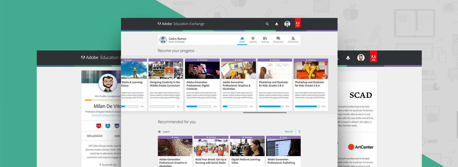
 This is why Wrecking Ball gave Adobe's Education Exchange search top priority when redesigning the homepage. The old page's design had "search" positioned out of the way and was not nearly as intuitive. By styling the search as a sentence and adding additional functionality to make it easier for the user, we made it simple to drill down to the exact criteria needed for a more qualified and refined search.
Keep the design simple
Another key factor is design. The design of an eLearning platform needs to be simple. While the design of the platform is important, it is not meant to draw all of the user's attention. The real purpose however, is to make it easier for users to find, discover, and interact with all of platform's content.
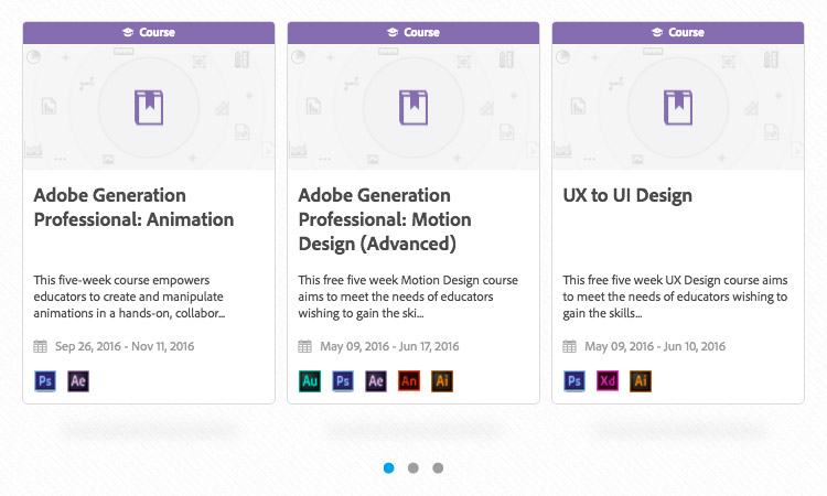 Wrecking Ball used a flat design style consisting of light grays, while blue's were used for links and buttons to draw the user's attention. Cards were used to display courses, programs, and discussions. While the core sections were consolidated onto the homepage as opposed to separating them into individual, bulky pages.
Make an eLearning Reward System
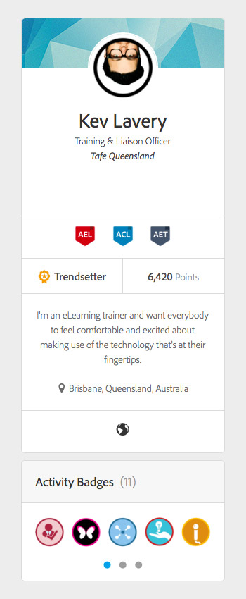 Creating a reward system is an excellent way to keep users interested in your platform by acknowledging their work and overall platform engagement. A badge can be given for a variety of accomplishments including the completion of a course and various other platform activities. The user's badges live on their profile so other platform users can see their accomplishments. Seeing others receive rewards for their achievements encourages other users to become even more involved.
Wrecking Ball took the reward system further by adding the ability to earn points. With a point system, users are encouraged to continue to add relevant data to their public profile so they can earn more points. This is an excellent way to keep users engaged and their profiles up to date.
Create a community
Today, social media is by far the most popular way for everyone to interact on the Internet. As humans, we are drawn to interactive communities. Building an interactive community is an excellent strategy for increasing audience and the popularity of your eLearning platform.
The community created by Wrecking Ball for Adobe Education Exchange also shares interaction design elements from Facebook and Twitter. Users can choose to follow each other and follow educators. They can also customize their profiles to further establish their identity and discuss eLearning topics in the discussion area of the platform.