All Posts in

Improving Large Touch Screen Kiosks

You often see large, interactive touch screen kiosk installations at trade shows, conferences, or static exhibits. The user usually walks up to the touch display and interacts with an application. This application might include video and written content with an interactive element, perhaps a quiz or a simple game. One might think developing for touch kiosks is the same as developing for a tablet except on a larger scale. There are definitely similarities between the two but the large format presents unique challenges and opportunities.

THE MAGIC OF HTML5

Typically, HTML5 is used to build touch-screen applications. The User Experiences are essentially single-page web applications. Wrecking Ball uses technologies such as WebGL to create fluid 3D experiences that feel nothing like a regular website. The application typically runs on a local PC that is connected directly to the touch display. The benefit is that there are virtually no concerns about file size, video streaming, or load time but you do have to be very careful about performance. Complex animations can be CPU intensive. Today's trend consists of building responsive websites for myriad screen sizes and devices. With large-scale, fixed screen sizes, we can build applications that only have to work on one browser at one specific resolution. The end result is an immersive experience that can be built on a fixed budget with a tight timeline.

FLAUNT YOUR CONTENT

Interactive kiosks work very well when presenting a large amount of content. Maybe you have hundreds of videos you want to showcase or thousands of entries in a database that you want to be displayed in a beautiful, attractive design. Interactivity and user experience plays a big role in the way it empowers the user to browse the content.

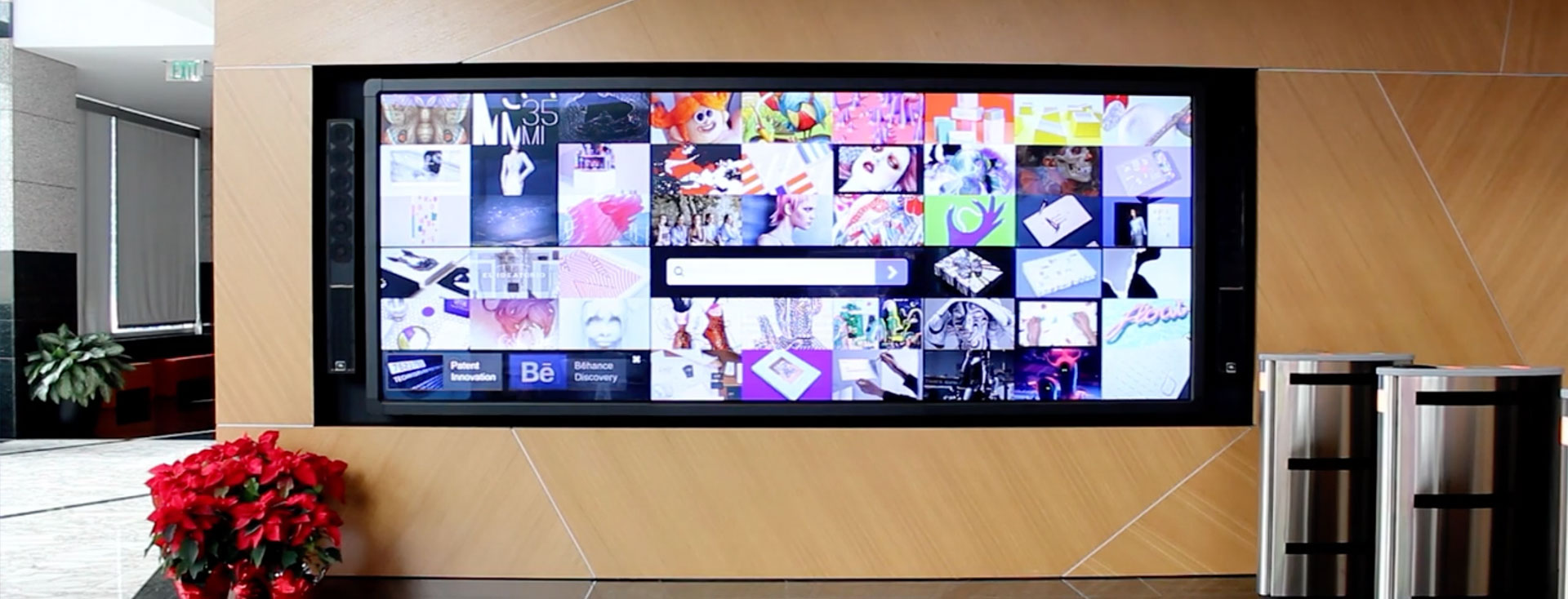
Adobe invited Wrecking Ball to concept, design, and build an interactive experience for their library of patents. Visitors to Adobe's home office can browse and learn about its 3,000+ patents and their hundreds of inventors while waiting in the lobby. Wrecking Ball developed the installation using web standards and built a custom CMS to manage the assets. The result was a beautiful, 3D, abstract object with each point in the object representing a different patent. Users can rotate the 3D object easily to browse patents. Wrecking Ball fine tuned the project with an original, visually stunning interface putting Adobe’s patents in the spotlight at Adobe's main headquarters!

patent-innovation

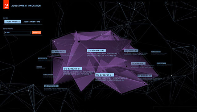
Learn more about Wrecking Ball's patent installation at the Adobe Patent Innovation page.

MAKE IT ATTRACTIVE

One aspect of creating an interactive kiosk is the experience when no one is using the device. Similar to the “attract mode” or “idle mode” of arcade games, our interactive kiosks have a similar idle experience. We have the option to show a video, show part of the main interaction, or cycle to a title screen with a call to action like “touch here to begin.” Everything is scripted using one or more looping timers and anything is possible.

Wrecking Ball had a great idea for a "idle mode" when asked to help Adobe define their Adobe Youth Voices program digitally. The new platform for Adobe Youth Voices launched with the #withMalala campaign, hosted by The Malala Fund. The interactive kiosk that Wrecking Ball built for #withMalala displayed global artwork aimed to incite social change. The idle mode of this kiosk was an elegant screensaver with scaling circles smoothly animating to look like a rising sun catching the eye of anyone who walked by the screen.

malala1 malala2 malala3

Learn more about Wrecking Ball's #withMalala platform at the Project 1324 page.

If you are interested in learning more about interactive kiosks or large scale, interactive touch screens, send us an email at hello@getwrecked.com.

Mobile Changes Everything

Are you looking to go Mobile first? Are you waiting for the shift to happen? Well, if you are waiting, you might be too late. Why? Because it's already happened! Marketers are no longer asking "if" they should invest in Mobile but rather "how" they should invest? People is investing more and more ever year in mobile devices, they want things they can take with them, including portable digital wallets the ones in this Ledger Nano S vs Trezor review. Every year there are trillions of searches on google.com and over half of those searches happen on mobile. Learn more about the latest ads and analytics innovations designed to grow your business in a mobile-first world.

Creating a Successful eLearning Platform

The global eLearning market has an estimated compound annual growth rate of approximately 25.2%. Back in 2012, the worldwide market for mobile learning products and services reached a total of $5.3 billion. The global eLearning market expects to reach $107 billion by 2016. With numbers like these, it's easy to see how profitable the eLearning market can be for thoughtful brands.

Wrecking Ball created Adobe Education Exchange, an education-based, eLearning community for the tech giant. The site features a large collection of educational resources to help instructors bring creativity into classrooms of all ages. Today it has gained a great deal of success with 55% of its members having participated in some sort of professional development activity. The Adobe Education Exchange's current catalog includes over 12,533 eLearning assets that have been viewed over 13.7 million times to date.

In this post, we will share with you key learnings from creating a successful, large-scale, eLearning platform.

Make search the star

By far the most critical feature of an eLearning platform is the ability to easily search through all available content. More than likely, you will have various courses/media/content in multiple categories. Without a good search feature, the site becomes cumbersome for a user looking to browse a website with lots of content. So having an easy and accessible search function is essential for the platform’s success.

edex02
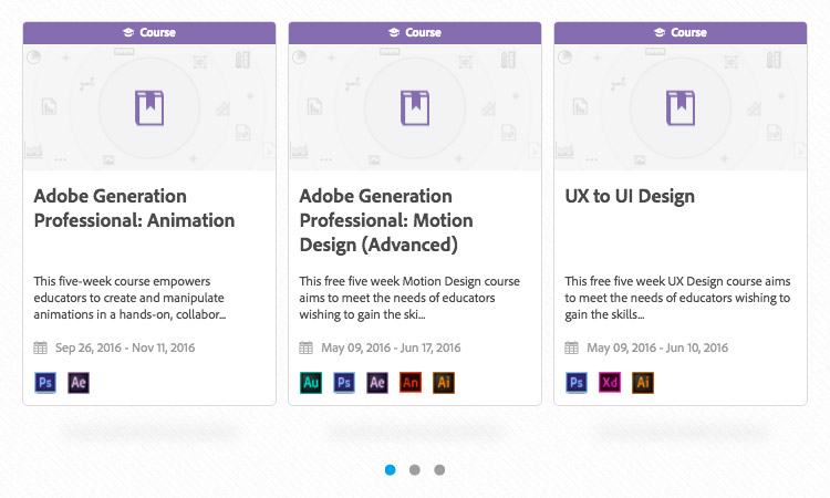
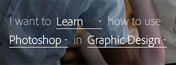
This is why Wrecking Ball gave Adobe's Education Exchange search top priority when redesigning the homepage. The old page's design had "search" positioned out of the way and was not nearly as intuitive. By styling the search as a sentence and adding additional functionality to make it easier for the user, we made it simple to drill down to the exact criteria needed for a more qualified and refined search.

Keep the design simple

Another key factor is design. The design of an eLearning platform needs to be simple. While the design of the platform is important, it is not meant to draw all of the user's attention. The real purpose however, is to make it easier for users to find, discover, and interact with all of platform's content.

edex03Wrecking Ball used a flat design style consisting of light grays, while blue's were used for links and buttons to draw the user's attention. Cards were used to display courses, programs, and discussions. While the core sections were consolidated onto the homepage as opposed to separating them into individual, bulky pages.

Make an eLearning Reward System

edex04Creating a reward system is an excellent way to keep users interested in your platform by acknowledging their work and overall platform engagement. A badge can be given for a variety of accomplishments including the completion of a course and various other platform activities. The user's badges live on their profile so other platform users can see their accomplishments. Seeing others receive rewards for their achievements encourages other users to become even more involved.

Wrecking Ball took the reward system further by adding the ability to earn points. With a point system, users are encouraged to continue to add relevant data to their public profile so they can earn more points. This is an excellent way to keep users engaged and their profiles up to date.

Create a community

Today, social media is by far the most popular way for everyone to interact on the Internet. As humans, we are drawn to interactive communities. Building an interactive community is an excellent strategy for increasing audience and the popularity of your eLearning platform.

The community created by Wrecking Ball for Adobe Education Exchange also shares interaction design elements from Facebook and Twitter. Users can choose to follow each other and follow educators. They can also customize their profiles to further establish their identity and discuss eLearning topics in the discussion area of the platform.

The Future of UI Design and Its Impacts on Everday Life

Science fiction often influences the world of technology by showing us the impossible. Today's iPad is essentially the tablet computer from Star Trek: The Next Generation, and Back to the Future II in 1989 got a lot right about the technology of 2015, now people use tablet and computers in their daily life to work, and play games with the help of csgo boost guide they can find online. In fact, the man who invented the world’s first flip phone, the Motorola Star-Tac, was inspired by the Star Trek communicator.

The future is definitely exciting when it comes to innovations in technology and  in many ways, the future is already here! In this article we will review examples of how future UI design will impact our everyday lives.

Gesture Interfaces

Tom Cruz in Minority Report. © 2002 Twentieth Century Fox Film Corporation.

Tom Cruz in Minority Report. © 2002 Twentieth Century Fox Film Corporation.

The most memorable futuristic user interfaces were shown in the Minority Report and Iron Man. These interfaces are the work of inventor John Underkoffler. He says the feedback loop between science fiction and reality is accelerating with every new summer blockbuster. He goes on to say, "there’s an openly symbiotic relationship between science fiction and the technology we use in real life. The interface is the OS - they are one."

In the video above, view a real-life demonstration of the futuristic user interfaces as seen in Minority Report. You can see how simple hand gestures can perform complex operations. Now imagine playing video games with such capabilities!

Light Ring

LightRing from Microsoft Research uses infrared to detect finger motion and a gyroscope to determine orientation, and it can turn any surface into an interface. You can tap, draw, flick and drag on a book, your knee, or the wall. For now, the interaction is with only one finger, but still provides a really attractive and natural looking way for user gestures.

This technology puts wearable computing to a whole new level! Imagine controlling your device anywhere and any way you choose. As shown in the video, the nature of using this technology is similar to using a mouse, so we are already familiar with how the product works.

Room Alive

RoomAlive is Microsoft Research's follow-up to IllumiRoom, which was presented at CES 2012. Both are steps towards a "this-is-our-house-now" Kinect future. The new system goes beyond projection mapping around a TV by adding input-output pixels on top of everything in the room. RoomAlive uses multiple depth cameras and spatially mapped projectors to overlay an interactive screen from which there is no escape.

Imagine “real-life” video games that transform your living room into the world of the game. Or imagine virtual home decoration, projecting your vision of what you want to rearrange or add to your home's decor.

Skin Buttons

The Skin Buttons project uses miniature projectors to display interactive icons on the skin around the watch face. This technology expands the interactive zone around a smartwatch without making it physically bigger. The projector parts cost less than $2 and can even increase battery life by shifting workload from the main display.

FlexSense

The FlexSense is a transparent sheet of plastic, but its embedded piezoelectric sensors detect exactly what shape it's in. This allows for all kinds of intuitive, paper-like interactions. For example, flipping up a corner to reveal something underneath, toggling layers in maps or drawings.

Imagine cell phone cases that react as you peel the cover. Or interactive books or children's books that react as you turn a page.

HaptoMime

HaptoMime uses ultrasound to create tactile feedback in midair, so you feel like you're touching a hovering image when there’s nothing there at all. It’s produced by a hidden LCD and an angled transmissive mirror. This technology has massive potential for any public display.

Zero UI

Zero UI isn't a new idea. If you've ever used an Amazon Echo, changed a channel by waving at a Microsoft Kinect, or setup a Nest thermostat, you've already used a device that could be considered part of Goodman's Zero UI thinking. It's all about getting away from the touchscreen, and interfacing with the devices around us in more natural ways. With methods such as haptics, computer vision, voice control, and artificial intelligence, Zero UI represents a whole new dimension for designers.

As these technologies become more intuitive and natural for the new generation of users, we will be treated to a more immersive computing experience that will continually test our ability to digest the flood of knowledge they have to share. The potential for change is both overwhelming and exciting for future user interfaces and it’s definitely something to look forward to when new technologies and ground breaking products come to market.

The Hard Truth About Website Speed

The time it takes for a page to load is an important part of any user experience. However there are times when you might choose to sacrifice load times in order to accommodate a better aesthetic design, new functionality or add more content to web pages. Unfortunately, website visitors care more about page loading times than an epic user experience. Also, website load times are becoming even more important when it comes to search engine rankings and mobile usage. Mobile visitors expect websites to load instantly, while using the slower speeds of mobile networks.

THE HARD FACTS:

  • Nearly half of users expect a site to load in 2 seconds or less
  • Additionally, they tend to abandon a site that isn’t loaded within 3 seconds
  • 79% of users who have trouble with performance say they won’t return
  • 44% of users would tell a friend if they had a poor experience

Site Analysis Tools

Are you interested in finding out how long it takes for your website to load? There are several free tools available. These tools report the number of requests, file sizes, and server response speed of your pages. Some even provide suggestions on how to improve your load times.

Ensuring fast load times

At Wrecking Ball, we go out of our way to ensure the platforms we build for our clients are optimized for fast load times. Our hosted content is delivered through Amazon’s high-speed AWS Cloud Hosting. Our CSS is optimized by the leading preprocessor, Sass. In the backend, such features as gzip compression and caching are enabled. Those are just some of our many practices for bringing down the loading time of our websites and applications.

Further reading

What makes the best app?

We are living in the age of mobile. Creating a mobile app is often necessary if a company wants to keep their name and services top of mind on today's mobile devices. As app users ourselves, we each have our own idea about what makes an app great. At Wrecking Ball, we have a lot of experience building awesome apps and we always ask the question - What are the characteristics that make a best-in-class app?

For Turner Studios, we created an interactive desktop publishing app. The app had attracted high ratings and waves of positive comments. You can learn more about it on Behance.

To understand more about what makes a great app, we polled our team of senior product managers, designers, and developers and came up with four areas to focus on for creating the best app possible.

Focus on one thing and do it well

The “less is more” principal weighs heavy in app design. A common mistake is to cram too many features into an app. Apps need to do one thing well. Those that focus on a simple concept have more of a chance to succeed.

Our app for Turner Studios focused on content delivery, showcasing their best work to stand out from their competition. With a simple navigation, you can browse featured content and videos.

Key Takeaway: Start with your core focus, execute it well, and earn the right to focus on additional features.

Know your audience

A great app is designed for its target audience. It understands its audience and caters to specific needs. It solves a problem that users struggle with on a regular basis that's unique to its target audience.

The essence of the idea needs to be unique to its audience. It talks to the specific needs of its users and either offers them something new that they didn’t know, something missed, or solves a problem that users struggle with on a regular basis.

Everyone knows about Turner Studios but their audience wanted to learn more about their amazing content. Our app made it easy to consume that content.

Key Takeaway: Research your audience and focus on meeting their specific needs.

Stability and speed are everything

Think about the main apps that you use every single day. They don’t crash, aren’t slow, and they do what you expect them to do. Great apps offer fast response times. In a matter of seconds, users can get in and out of the app and do what they were intended to do. These apps offer experiences like those of default apps put out by Apple and Google - they just work. We take this for granted. It’s not easy to get to that point. It takes patience and work to fine tune your app to reach this state.

Key Takeaway: Speed is a feature. Keep your scope tight to ensure your app is both stable and fast. Don't rush and always test for continuous improvement.

Keep it polished

Polish really helps separate an app. Focusing on the small details can help separate it from other apps and inspire both users and other app creators alike. Sprinkle a bit of design magic on it. Add something fun; anything that would make users smile.

Key Takeaway: The details matter. Animations, sound effects, interactions, and other little flourishes bring the app to life and make it impressive.

Conclusion

A great app is focused, intuitive, fast, and a pleasure to use. You should regularly explore apps featured on the app stores and those that receive awards from Apple and Google. By focusing on fulfilling the four criteria above, you'll have a greater chance at making the best app!

Further reading

Welcome to Wrecking Ball Studio + Labs

Welcome to Wrecking Ball Studio + Labs -- the relaunch of our brand and our website!

What happened to Media Group? Good question! And why Studio + Labs?

Since 2007, we have gone by the name Wrecking Ball Media Group. For many years, the name seemed apropos! Yes, we were focused on heavy tech work but we were starting to focus more on digital design, photography and video production. Ya know -- 'media work'.

So over the last decade our services vastly expanded while many people thought we were a 'media agency', a company that bought and sold ad space. So it got us thinking… perhaps it's time for a brand refresh and let the world know who we really are?

As a digital agency, we (and many others) are split into a few internal groups. When deducing it down to the core of the Agency, we are a Studio and a (Digital) Lab.

The Studio: Where greatness is forged, pixel by pixel, with sharp strategy and powerful design. From the dark arts of UX and UI, to video editing, digital publishing, integrated marketing campaigns, with the collaboration as agencies like SEO Cherry and others. In other words, problem solved.

The Lab: Our research center for all things binary. Where experimentation meets engineering, and curiosity is crash-tested then made ready for prime time. It's the playground for us geeks where we push technology (at times breaking it).

So, we adopted the name Wrecking Ball | Studio + Labs (or just Wrecking Ball). It is who we are and provides more clarity of our mission to the general public.

With the updated name we needed a new URL. As the squatter owner of 'wreckingball.com' is holding out for asking six-figures and up to purchase the domain name, obtaining that URL was not the best use of funds.

Good news is, 'getwrecked.com' was available.

The double entendre speaks for itself to the sense of humor we have as an agency. It definitely raises an eyebrow and gets others to chuckle. Ultimately, the true meaning is -- If you have a challenging project that needs to be done right, then work with us - Get Wrecked!

Wrecking Ball Named #7 of the Top Web Design Firms in South Florida

In January, Wrecking Ball was nominated as a best place to work in South Florida and the accolades didn’t end there. The South Florida Business Journal (SFBJ) also ranked Wrecking Ball #7 for this year’s Website Design & Development Companies list. Bringing Wrecking Ball into the Top 10 out of 80+ entries for the first time.

This is an accomplishment that the entire company is extremely proud of and we attribute our success to the hard work of our staff and colleagues. We would also like to thank the loyalty of our valued, client partners.

See the official companies list below from the South Florida Business Journal. Get wrecked!

sfbj

You can view the full list and learn more at South Florida Business Journal's announcement article.

6 Steps to Creating a Knockout Behance Portfolio

Behance is the most popular website for creatives to show off their work. Naturally, showcasing your portfolio on a site like Behance is one of the most effective ways to promote your skills and talent. There are many approaches toward creating a portfolio on Behance. The 'boring' way is to simply insert pieces of your work on a solid background. The exciting way is to design all your portfolio pieces together into a single, harmonious design.

Here are a couple of fully designed portfolio page examples from Wrecking Ball:

Behance - TWC   Behance - Adobe Inspire

Awww yeah! Pretty cool, huh? Are you interested in taking your Behance portfolios to the next level? This article we will give tips on how to make a knockout portfolio that gets you noticed.

1. Select your best work

Your Behance portfolio is most effective as a series of projects: one project per Behance page. If you don’t have much work to show, you could bundle many projects into a single Behance page. A Behance page shouldn’t display all of your work. It’s best to keep it short and sweet, selecting only your best pieces. We recommend selecting, at least, five pieces for a single Behance page.

Remember, it’s better to have a portfolio where you show a few of your best projects that are stunning. Showing many average projects would not be as attractive. The quality of your portfolio is only as good as your weakest project.

2. Share a backstory, complemented by a theme

Deep dive into your work and think about how you will present it. People are drawn to stories. Developing a brief backstory for your project will pull your viewers in. Talk about your story from the initial concept to early sketches, to the finished product. Start your story by showing the finished piece first, followed by your progress which led you to it.

Think about the style and general look and feel of your project to come up with a design for the layout. The design elements you come up with should compliment and enhance your project. Take a closer look at Wrecking Ball’s TWC onDemand project for an example:

Behance Background

Notice how artwork featured in the Adobe Inspire Digital Magazine is used as a decorative background.

3. Flaunt the medium

reading inspire

Using Adobe Inspire

Did you make a website? Then show it on a desktop, tablet, and smartphone. Did you make an app? Show it on its target device. Did you make a magazine? Then show people reading it. Emphasize the medium for the intended work. If possible, take pictures of people interacting with it. Otherwise, Google around for free templates where you can easily insert your work for a nice presentation. Here’s a collection of free tablet/smartphone templates.

4. Keep it simple

The design of your Behance page needs to be simple. We can’t stress the KISS principle enough. Avoid the temptation to make an elaborate design to push for a wow factor. Simplicity pushes your work to the surface, where it should be. Pick one font, pick a color scheme, and stick to it; keep the style consistent.

5. Craft a bio

An important part of your Behance portfolio is your Behance profile. Fill in your profile’s description with your story. Ask yourself, what’s your point of view? What’s your unique perspective on the creative world? What led you to develop this perspective? Answering these questions will help you zero in on your passion. Passion is infectious; putting it into words will make you shine.

6. Keep your Behance gallery fresh

Behance is a large, active community. Posting just once gets you ignored. Those who post on a regular basis attract an audience. Popularity is measured by likes and comments. Your posts on Behance become more reputable when you consistently attract engagement. Popularity has a snowball effect which increases the number of likes/comments. As you create new and better work, make sure you make additions to showcase your latest projects, but with the same focus on careful curation.

To view more examples of awesome Behance portfolios, check out Wrecking Ball on Behance.

Wrecking Ball Is a Best Place to Work

Each year, the American City Business Journals asks employees across the country to provide honest feedback about their work experience and company cultures.

The survey is strictly confidential. All employee feedback is collected and processed by Quantum Workplace. The Journal then publishes the results online in a special edition issue called The Best Places to Work and ranks the top companies by staff size.

Well, the results are in, and Wrecking Ball Studio + Labs is honored to be selected as a  finalist for the 2016 South Florida’s Best Places to Work. The recognition is the result of our determined work ethic, our high quality standards and a forever grateful crew of talented Wreckers.