Human Amplification Index logo in white

Building the First Index for Human Amplification

Sol Rashidi invented a way to measure whether AI is amplifying people or quietly replacing them. We built the brand and the application that proved a new measurement model could stand up as a product.

OVERVIEW

Turning a New Measurement Model Into Working Software

Services

AI Engineering
Backend Architecture and API Development
Brand Identity and Design System
Cloud Infrastructure
Data Visualization
Product and Interface Design
Prompt Engineering and Management
Proof of Concept Development

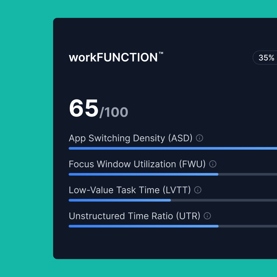
The Human Amplification Index™ is the first framework built to answer a question every company investing in AI is asking and almost none can answer: is any of this actually making our people better at their work? Created by Sol Rashidi, former Chief Analytics Officer at The Estée Lauder Companies and former Chief Digital Officer at Sony Music, HAI™ measures AI return across three lenses. workFLOW™ maps the flow of thought. workFUNCTION™ measures alignment between the work being done and the goals it serves. workFORCE™ asks whether people are being used to think, create, judge and adapt, or to babysit machines.

The framework was sharp, defensible and completely theoretical. Between the thesis and a product sat a long list of unanswered questions. Could the metrics be calculated from the data companies actually have? Would the numbers hold up under scrutiny? Could a language model write a credible narrative from them without drifting or inventing? Nobody knew, because nothing had been built.

Wrecking Ball partnered with Sol to find out. We designed the brand and built the working proof of concept: a production-style service that ingests raw desktop activity, computes thirteen metrics, rolls them into three pillar scores, resolves them into a single HAI score, and generates an AI-written analysis with a full audit trail behind every number.

THE CHALLENGE

An Idea Fully Formed as a Thesis and Completely Unformed as Software

Most AI programs do not die from bad technology. They die at the proof of concept stage, where an idea meets real data for the first time and the gap between the two turns out to be wider than anyone planned for. HAI™ exists because of that failure pattern, which meant its own proof of concept had to survive the exact problem it was built to diagnose.

The starting point was a set of ideas written to explain a framework, not to build one. Everything else followed from that.

A Framework With No Blueprint

The thirteen metrics existed as plain-language descriptions written to explain an idea, not to build one. Every calculator had to be derived, tested against real behavior and tuned before a single score meant anything. The pilot dataset covered roughly two weeks of desktop activity from one company, enough to prove the numbers behaved sensibly and not enough to prove them at scale, so scope had to be set by what the data could genuinely support. On top of that, every value needed a path back to the raw activity behind it, and the AI-written analysis had to stay consistent and honest. A single index number is easy to dismiss and impossible to defend without provenance.

A Category With No Language

HAI ™ is not analytics software and not a productivity tracker. It sits in a space with no shorthand, no visual conventions and no competitive set to react against, which meant there was nothing to borrow and nothing to push against. The harder problem was tone. Measuring how people work reads as surveillance unless the design makes the opposite intent obvious, and that distinction is the entire premise of the framework. If the brand got it wrong, HAI™ would be misread on sight, before anyone looked at a number.

Woman looking through lush green foliage

THE BRAND

Designing the Face of a Measurement Nobody Had Seen Before

The brand had to do something specific. It had to make a number feel like an insight, and it had to make workforce measurement feel like advocacy for people rather than surveillance of them. That distinction is the entire premise of HAI™, and if the interface got it wrong, the framework would be misread on sight.

The mark reads as three strokes resolving into a form, an index built from its parts. It works at favicon scale and holds up as a standalone product signature.

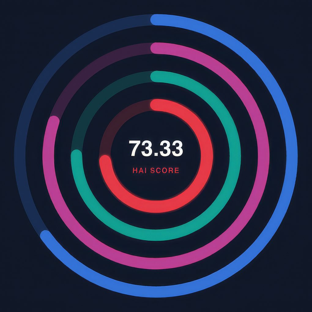
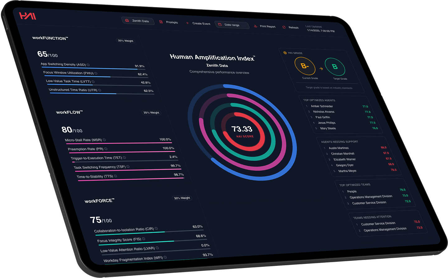
The interface runs dark by design. Deep, low-glare ground puts the data forward and gives the score the presence of an instrument reading rather than a report page. The HAI score itself is rendered as concentric rings, each pillar carrying its own color, converging on the single number at the center. It communicates the model’s logic without a legend: three lenses, one index.

Human Amplification Index logo in red on a dark background
Human Amplification Index brand font specimen for Inter Semi Bold
Human Amplification Index workFUNCTION score card UI
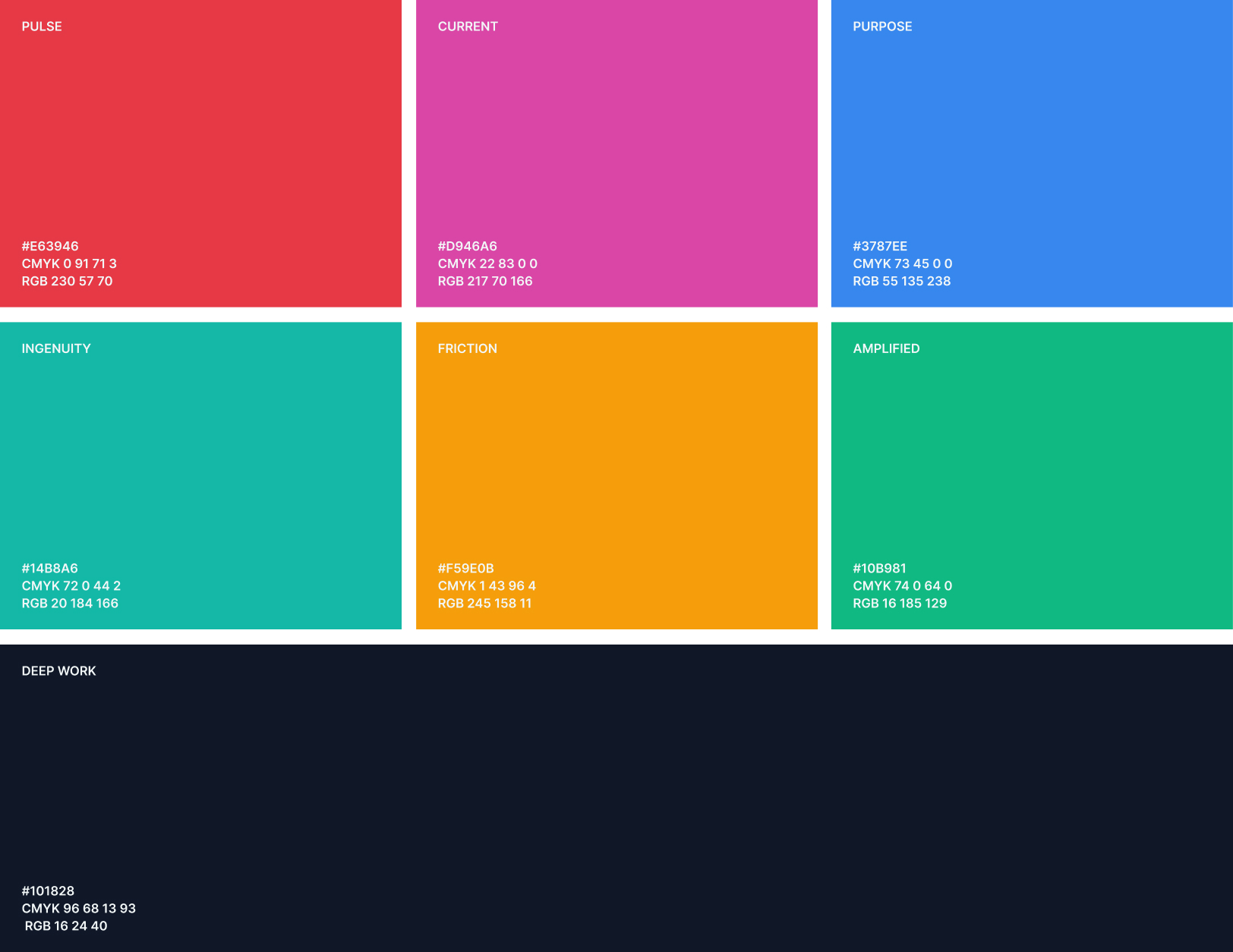
Human Amplification Index brand color palette
Human Amplification Index ring chart showing an HAI score
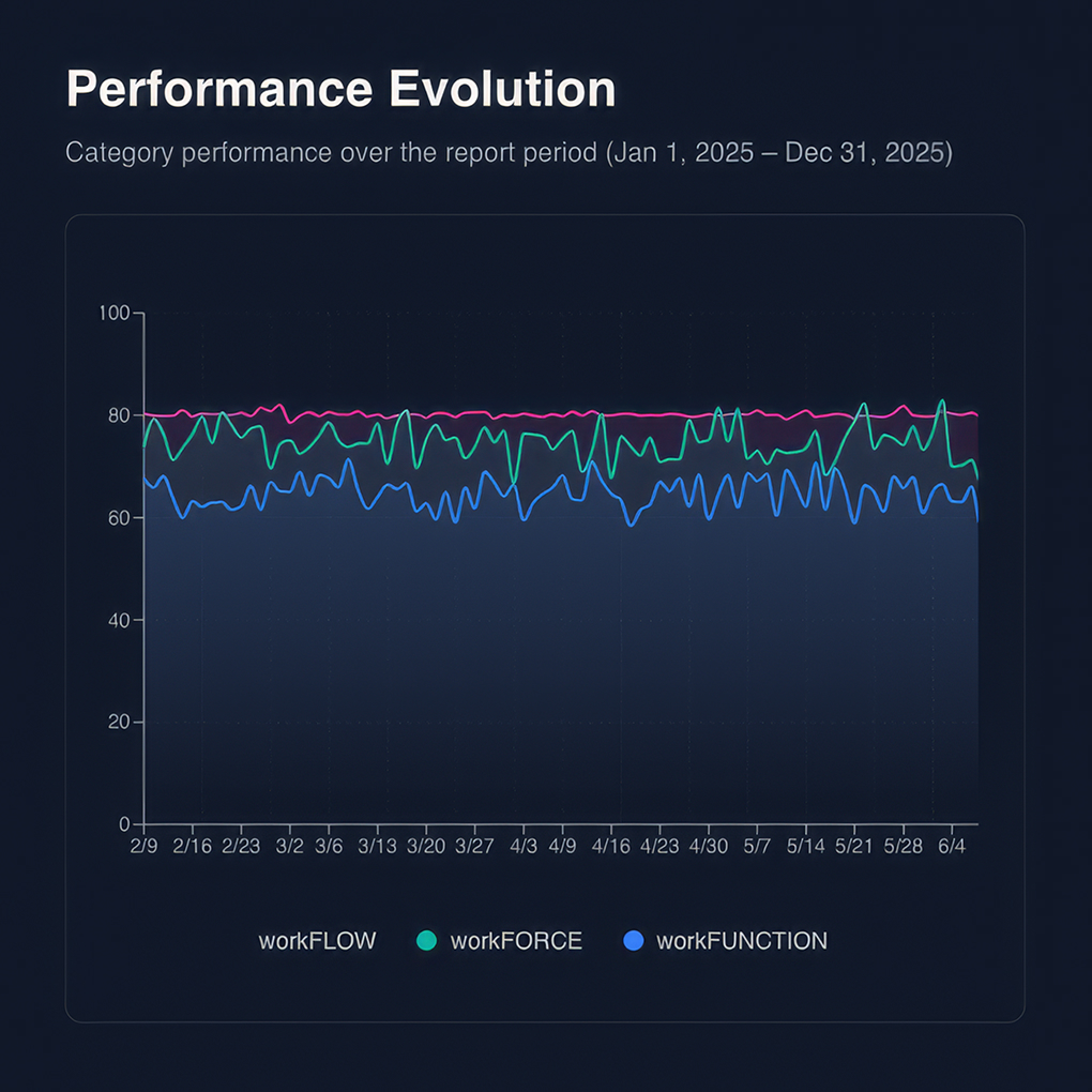
Human Amplification Index performance evolution line chart
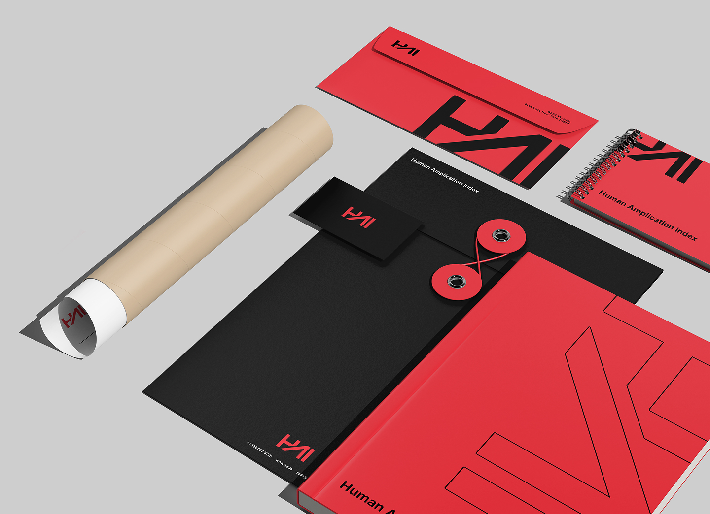
Human Amplification Index branded stationery in red and black
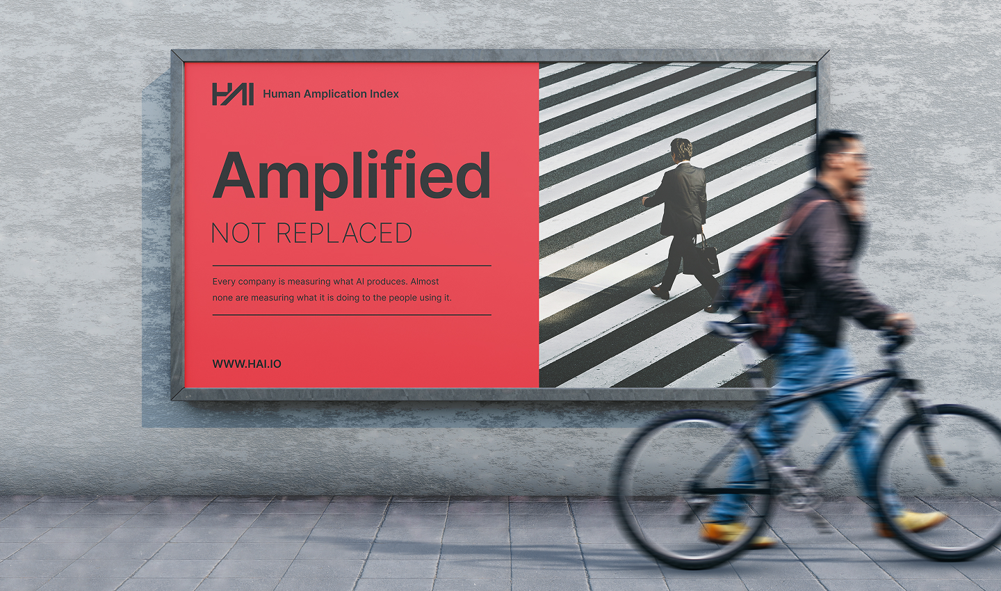
Human Amplification Index billboard reading Amplified not replaced with a cyclist

THE SOLUTION

A Working Service, Not a Slide About One

We built the proof of concept as production-style software from the first commit. Go for a single-binary deployment, PostgreSQL for the data model, REST APIs for every operation, and an architecture designed to be extended rather than replaced.

Human Amplification Index dashboard shown on a tablet

One Score, Fully Assembled

Thirteen metrics roll into three weighted pillars and resolve into a single HAI score, calculated for every person, every day. Weights are configurable, so the model can be tuned to how an organization actually works without touching code. Every calculation is deterministic, which means the same data always produces the same number.

Work Blocks, Not Raw Events

Raw desktop activity is a stream of noise, and noise makes bad metrics. We made work blocks a first-class concept, grouping activity by context, focus integrity, time and task switching. That single decision sharpened the metrics and made the model’s behavior explainable to the people being measured.

A Trail Behind Every Number

Metric values link to pillar scores, pillar scores link to the index, and every score resolves back to the raw activity behind it. Calculation sessions and audit detail were built in from the start rather than added later. When a number gets questioned, and it will, the answer is already in the system.

Analysis Tuned Without a Deploy

AI reporting runs through AWS Bedrock, giving the platform one interface across multiple model backends. We built a versioned prompt management system so analysis can be adjusted and rerun without shipping code. Guardrails live inside the managed prompts, which cut tone drift and hallucination and made the output steady enough to put in front of a leadership team.

Built to Be Run

The service ships as a single binary with config-driven deployment, health checks, authentication, logging and documented APIs. A synthetic data generator lets the platform be demonstrated and stress tested without waiting on a client dataset. It was built to production standards from the first commit, not dressed up as a demo.

A Dashboard You Can Act On

Pillar cards carry their weight and underlying metrics at a glance, with the index at the center as three converging rings. Below it sit the people and teams performing at their best and the ones who need support. A performance evolution view turns a point-in-time score into a trend worth managing against.

Team discussing ideas around a table in an office

THE RESULT

A Framework, not a Thesis

HAI™ went from a defensible thesis to a running platform with a brand, an interface, an API and an audit trail. The framework holds up against real activity data. The scores are reproducible. The AI analysis is consistent enough to put in front of a leadership team. The architecture is ready to extend as new metrics, new data sources and new customers arrive.

More importantly, the hypothesis got tested before anyone spent a production budget proving it the expensive way. That is the entire argument for building a proof of concept properly: the fastest route to a real product is a small, honest version of it that either works or tells you exactly why it does not.

This engagement is a clear example of how we work with AI. Brand, product design and engineering under one accountability surface, with a bias toward shipping something real early enough that the strategy still has room to change.

PROOF OF CONCEPT OUTCOME

What We Built and What It Proved

13

Metrics designed, built and validated against real work data

3

Pillars weighted into scores an executive team can act on

1

Index that turns everyday desktop activity into a measure of AI return

4

Blocking strategies tested to make the metrics hold up against real behavior

100%

Score traceability, from the index back to the activity behind it

Zero

Production budget committed before the model was proven

BE DISruptive

The Art of the Impossible, Made Possible

HAI™ needed to prove that a framework written to explain an idea could survive contact with real data, and it needed a brand before anyone would take the number seriously. By deriving the metrics from scratch, building the scoring engine to production standards, and designing an identity for a category that had no visual language, we turned a thesis into a platform that runs, with an honest account of what has to be true before it scales.

This project exemplifies our approach to brand, product design, and AI engineering under one roof, where identity, interface, and the system underneath are built as one engagement, small enough to prove the idea and real enough to build on.

Human Amplification Index logo in black

Ready to Prove Your AI Idea Actually Works?

At Wrecking Ball, we build working proofs of concept for companies betting real money on AI. Connect with us to turn your idea into a running platform, with a brand around it and an honest answer about what it takes to scale.

More for Your Interest

Huntress logo

Creating a New World for the Huntress Brand

Huntress logo

We turned a brand refresh into a system, applied across the Huntress digital experience and backed by AI tooling that keeps the brand consistent as it scales.

Adobe logo

Turning Patents Into Interactive Storytelling

Adobe logo

How Wrecking Ball transformed Adobe's 3,000+ patent archive into a touchscreen interactive installation that brings innovation to life across lobbies worldwide.

Dolby logo

Designing a Scalable Service Management Portal for CX

Dolby logo

A Strategic UX and Design Initiative for Future-Ready Customer and Support Experiences